

Table of content
What is CSS
What is a CSS page layout
What is Flexbox
Flexbox Architecture
CSS Flexbox Property
Wrapping up
1. What is CSS ( Cascading Style Sheet)
CSS is a language for specifying how documents in HTML are presented to users it adds beauty to the web page from how they are styled and laid out, and variations for different screen sizes.
2. What is a CSS page layout
CSS page layout techniques allow us to take elements contained in a web page and control where they're positioned relative to the following factors: their default position in normal layout flow, the other elements around them, their parent container, and the main viewport/window.
3. What is Flexbox
The Flexible Box Module is a modern layout mode in css3 usually referred to as flexbox. it was designed as a one-dimensional layout model, making it easier to design a flexible responsive layout structure without using float or positioning. it provides control over alignment and space distribution between items within a container. Being one-dimensional, it only deals with the layout in one direction either columns or rows at a time.
4. Flexbox Architecture
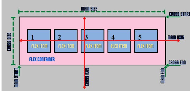
To show how the flexbox architecture works The flex items (contents) can be laid out either along the main axis (starting from the main start and ending at the main end) or along the cross axis (starting from the cross start and ending at the cross end).
Main axis: Flex items are laid out along this axis, either horizontally or vertically based on the flex direction.
Cross axis: It is perpendicular to the main axis and its direction depends on the direction of the main axis.
Main size: It is the width/height of the flex item depending on the main dimension.
Cross size: It is the width/height of the flex item depending on the cross dimension.
5. The CSS flexbox property
For a better understanding of the flexbox property, let's use examples by creating HTML and CSS files.
<!DOCTYPE html>
<html lang="en">
<head>
<meta charset="UTF-8" />
<meta http-equiv="X-UA-Compatible" content="IE=edge" />
<meta name="viewport" content="width=device-width,
initial-scale=1.0" />
<title>CSS Flexbox</title>
<link rel="stylesheet" href="style.css" />
</head>
<body>
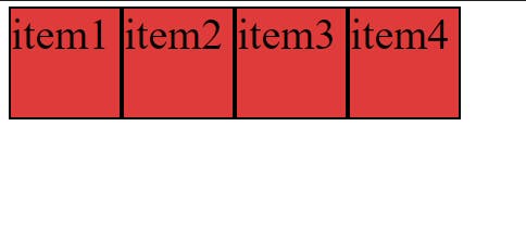
<div class="container">
<div class="item item-1">item1</div>
<div class="item item-2">item2</div>
<div class="item item-3">item3</div>
<div class="item item-4">itrem4</div>
</div>
</body>
</html>
.container {
  height: 100vh;
  }

.item {
  width: 140px;
  height: 140px;
  background-color: skyblue;
  border: 2px solid black;
 font-size: 65px;
}
From the above code snippet, the items are aligned vertically, by default, and the default display is block-level. But wait, let's understand that the Flexbox works on the parent class, not on the child classes.
Here, the .container class is the parent and our .item classes are our children.
Properties for the Parent/Flexbox:
display: Let’s make the container flex by setting its display to flex inside the .container of our CSS file.
 .container {
   height: 100vh;
   display: flex;
   border: 5px solid rgb(0, 0, 0);
   background-color: rgb(245 197 221);
 }

 .item {
   width: 140px;
   height: 140px;
   background-color: skyblue;
   border: 2px solid black;

   font-size: 65px;
 }
Output: After applying the display: flex property, the items have been aligned horizontally as the default flex-direction of flexbox is a row.
flex-direction: It sets the direction of the flex container's main axis and specifies how the children will be placed inside the parent container.
Syntax:
flex-direction: attribute value
Attribute Values:
row: Flex items are displayed horizontally along a row.
column: Flex items are displayed vertically along a column.
row reverse: Flex items are displayed horizontally along a row but in reverse order.
column reverse: Flex items are displayed vertically along a column but in reverse order.
flex-wrap: It specifies whether the flex container will have a single line or be wrapped onto multiple lines.
Syntax:
flex-wrap: attribute value
Attribute values:
no-wrap(default): It specifies that the flex items will not wrap and will be laid out in a single line. which may cause an overflow in the container.
wrap: It specifies that the flex items should l wrap if necessary, and will be laid out in multiple lines.
wrap-reverse: It is the same as a wrap, but the flex items will wrap in reverse order in this case.
justify-content: It defines how items are positioned along the main of the current line.
Syntax:
justify-content: attribute value
Attribute values:
flex-start (default): Flex items are positioned towards the start line of the container.
flex-end: Flex items are placed at the end of the container.
centre: Flex items are positioned in the centre line of the container.
space-between: Flex items are distributed evenly, the first item will be at the start line and the last item will be at the end line of the container.
space-around: Flex items are distributed evenly, with half the amount of space at the start of the first item and the end of the last item.
space-evenly: Flex items are evenly distributed within the alignment container along the main axis.
align-items: It defines how flex items will be aligned along the cross-axis of the current line of the container (perpendicular to the main axis). You can think of
align-items, as thejustify-contentversion for the cross-axis (perpendicular to the main axis).Syntax:
align-items: stretch|center|flex-start|flex-end|baseline|initial| inherit;
Attribute Values:
stretch(default): The items stretch to fill the container
flex-start: Items are aligned along the cross-start line.
flex-end: Items are aligned along the cross-end line.
centre: The items are centred on the cross-axis.
baseline: The items are aligned in a line in such a matter that their baselines align.
align-content: When there is extra space in the cross-axis, align-content aligns multiple lines within the container. It is similar to justify-content which aligns individual items within the main axis.
Note: this property has no effect when the flexbox has only a single line.
Syntax:
align-content: attribute value
Attribute values:
flex-start: Lines are aligned towards the beginning of the container.
flex-end: Lines are aligned towards the end of the container.
centre: Lines are aligned towards the centre of the container.
space-between: Lines are evenly distributed, the first item will be at the start and the last item will be at the end of the container.
space-around: Lines are evenly distributed, with half the amount of space at the start of the first item at the end of the last item.
stretch(default): Line stretches to take up the remaining space.
align-self: It defines how individual flex items are aligned along the cross-axis.
Syntax:
align-self: auto|stretch|center|flex-start|flex-end|baseline| initial|inherit;
Attribute Value:
flex-start: Aligns items at the beginning of the container.
flex-end: Aligns items at the end of the container.
centre: Aligns items at the centre of the container.
stretch: Aligns items to fit the container
### Other Properties which can be used with flex-box are:
Flex-basis - This specifies the initial size of the flex item.
Flex-flow - This is a combination of flex-direction and flex-wrap properties.
Flex-shrink - This defines the ability of a flex item to shrink if necessary.
Flex-grow - It defines the ability of a flex item to grow if necessary.
Flex - This is a combination of flex-grow, flex-shrink and flex-basis properties.
6. Wrapping up :
flex-box is used to create a flexible and responsive layout whereby containers are aligned either vertically or horizontally.
Other resources on flex:
https://css-tricks.com/snippets/css/a-guide-to-flexbox/ https://www.freecodecamp.org/news/css-flexbox-complete-guide/